Lone Pine: Positioning Connection and Quality at the Heart of a Brand
A Vision Rooted in Connection
When sommelier Josh Mazanowski envisioned his second restaurant, Lone Pine, he sought more than just a high-end dining spot (he’s also a partner at the beloved BEHOLDER in Indianapolis). Inspired by his family’s ranch in Lonepine, Montana, his vision was for a space centered on genuine comfort and quality, a place where people could connect over a meal without pretension. Flatland Kitchen collaborated with Josh to bring this vision to life, helping Lone Pine stand apart in Carmel as a restaurant that values authenticity and accessibility over flashiness.
Creating Differentiation in a Saturated Market
Unlike many establishments focused on trends or accolades, Lone Pine offers a space where luxury feels refreshingly unforced. Flatland Kitchen worked with Josh to articulate the essence of Lone Pine as a brand grounded in “genuine ease.” Rather than positioning Lone Pine around a single dining concept, FK highlighted the brand's commitment to making guests feel at home—a differentiator in a market filled with “steakhouse” or “wine-centric” restaurants. This thoughtful approach allowed Lone Pine to connect with guests who seek authenticity and comfort rather than a rigid dining experience.
A Story Worth Sharing
Flatland Kitchen focused on more than brand visuals, crafting a story that resonates through every guest interaction. Anchored in Josh’s family legacy and hospitality background, the Lone Pine narrative becomes an experience guests can feel from the moment they engage. Through intentional design and storytelling, FK ensured that every detail—whether on the website or in the restaurant—reflects Lone Pine’s essence of warmth, quality, and belonging.
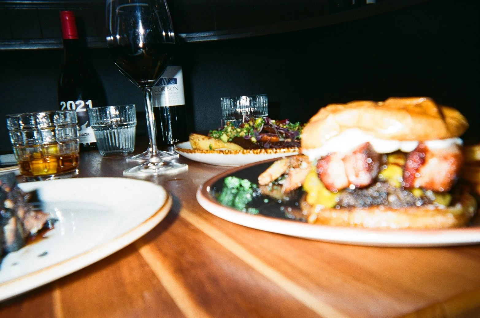
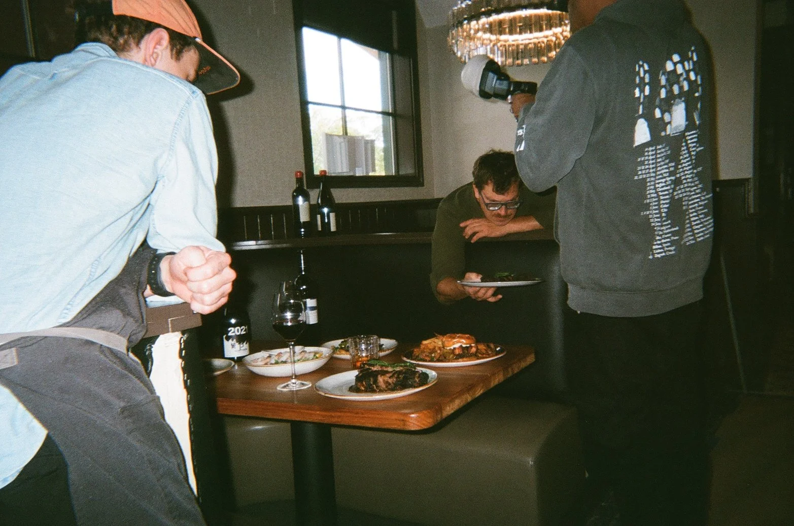
The photography and copy, for example, aren’t simply focused on food or ambiance. Instead, they capture moments of ease and connection, inviting guests to see themselves as part of Lone Pine’s unfolding story. Rather than promoting individual dishes or the chef’s credentials, FK’s storytelling underscores the brand’s deeper, people-centered values.
Subtle Yet Distinctive Design
Flatland Kitchen guided Lone Pine to create a brand identity that is both refined and approachable. With understated typography and clean design, FK emphasized an “effortless luxury” that doesn’t overpower the dining experience but enhances it. Elements like the logo and a film-based photography style reflect Lone Pine’s approachable sophistication, aligning with the restaurant’s values without feeling ostentatious.
Our ol’ Pal Casey Roberts has multiple paintings in the space and we brought him into the process to help with illustrations to bring cohesion to the whole thing.
Building a Lasting Brand
The journey with Lone Pine didn’t end at launch. As the restaurant evolves, FK continues to refine its reach and presence, supporting Lone Pine’s deeper integration with the local community. From developing a merchandising approach to enhancing its digital presence, FK ensures that every step aligns with Lone Pine’s founding vision. Together, FK and Lone Pine have created more than just a restaurant; they’ve built a brand where every visit feels like a return to something meaningful.


